Web design
Architecture
Optimization
Porvenir: effortless navigation, lasting satisfaction
Porvenir is a Pension and Severance Fund Administrator. It has consolidated as the administrator with the largest number of affiliates and managed resources in said funds. In addition, it is part of the AVAL Group, one of the most important financial multinationals in the country.
Its objective is to "generate trust and well-being with its affiliates," so they needed a portal that reflected professionalism and credibility.
The client requested improvements to their website due to several critical issues that were affecting the user experience. The current navigation system was inadequate, making it difficult for users to find the information they needed. Furthermore, the page lacked visual consistency, presenting a messy and unprofessional design. The information architecture was confusing, leading to frustration and making it difficult to understand the services offered.
01
Improve the user experience and navigation to impact: transactional NPS, customer satisfaction, decrease in abandonment rates, and primary distribution channel.
02
Improve your visual consistency and optimize your design operation through the creation of a visual design system.
03
Clarify and reorganize your content model and information architecture to clarify and narrow down the content to be produced and maintained, contribute to ease of use and navigation, and assist with content deduplication and SEO positioning efforts.
Process
The process consisted of 4 main phases. The first involved meetings with the client to define priorities and conducting tree testing to improve the sitemap. The second was defined by usability testing and card sorting to adjust the sitemap. In the third, medium-fidelity prototypes were created to evaluate their usability, there were meetings with the client and the development team to define the content structure. For the fourth phase, the visual style was defined based on sessions with stakeholders to understand the brand, also in this phase the components and patterns of the Design System were developed and documented.
Diagnosis
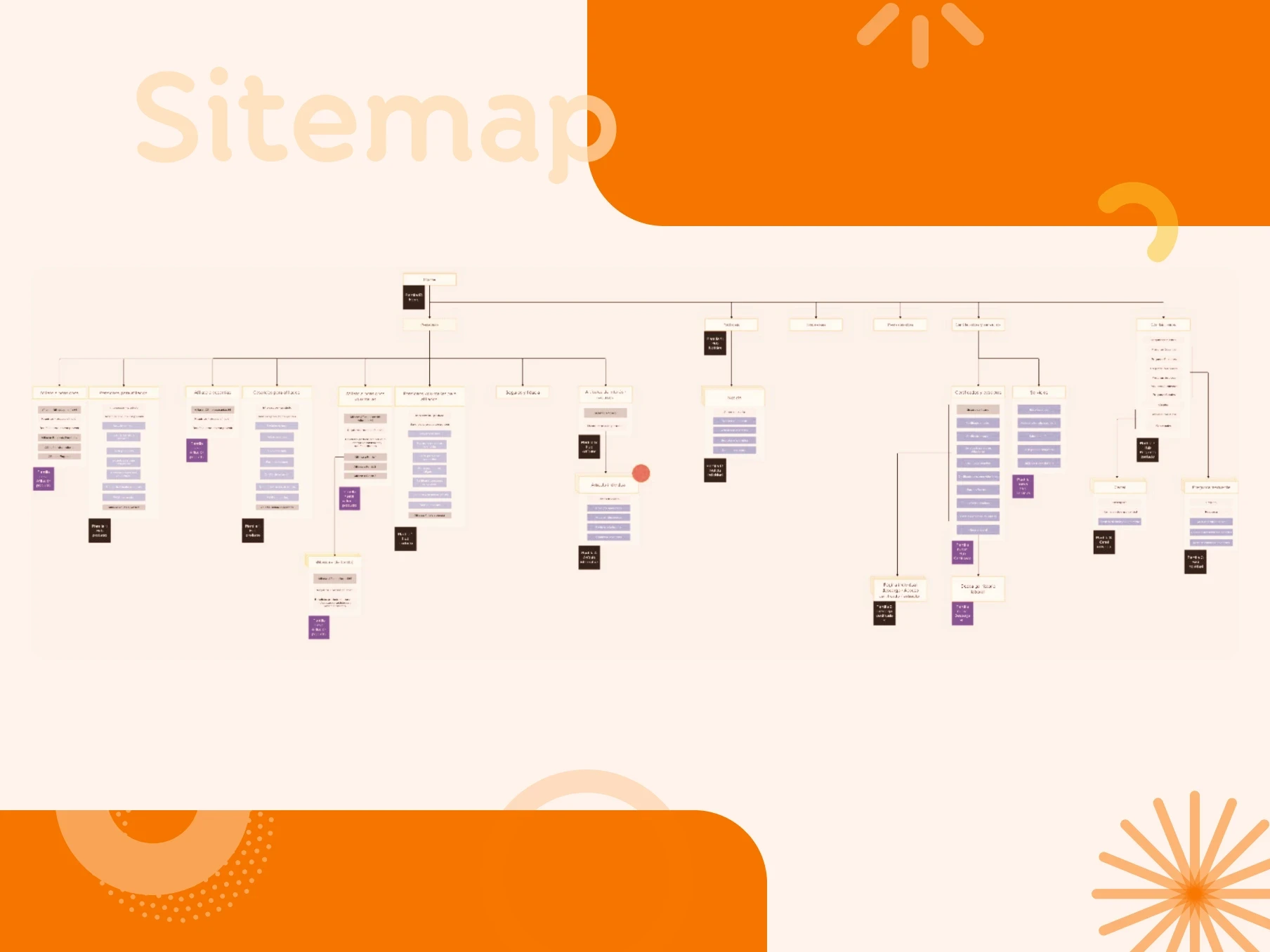
Sitemap
The sitemap was defined based on the findings of three methods: tree testing, card sorting, and a workshop with the client. The idea was to create a diagram that addressed the usability and navigation needs of the client and the users. The adjustments included interventions in all dimensions of Information Architecture: organization system, labeling system, navigation system, and search system.
Tree testing
A remote unmoderated study (survey type) was conducted in Maze to evaluate the navigability of the sitemap proposal advanced from the desk research by Porvenir. The activity was carried out with users of the Porvenir portal taken from the customer database.
01
Diagnose the effectiveness and clarity in navigating the new sitemap proposal for the general Porvenir portal.
54
respuestas
totales
38
respuestas promedio
por tarea
Conclusions
Discover
Card sorting
A qualitative study was conducted to understand the reasons for the problems found in the tree testing.
01
Find the way how users group and organize the content of the sections to clarify if they categorize it differently than the current sitemap.
02
Understand how users name the content to understand if the current labeling brings navigation problems because it does not reflect how users refer to it.
Results
8 general categories were determined based on the way users associated content in the test.
Main content or secondary content were identified in each category based on user feedback.
01
Actualización de datos
02
Afiliaciones
03
Afiliados
04
Archivo/información básica
05
Atención al usuario
06
Cesantías
07
Pensiones
08
Certificados
Solutions
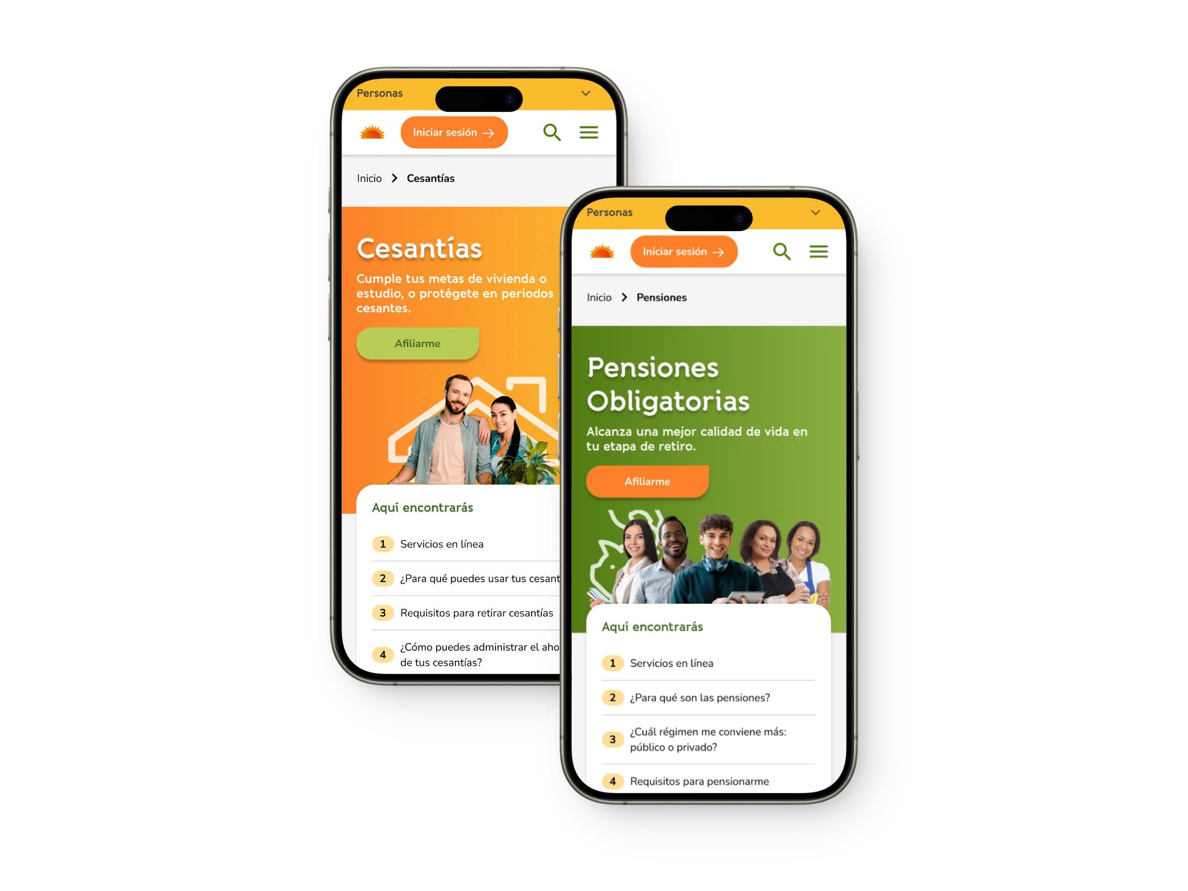

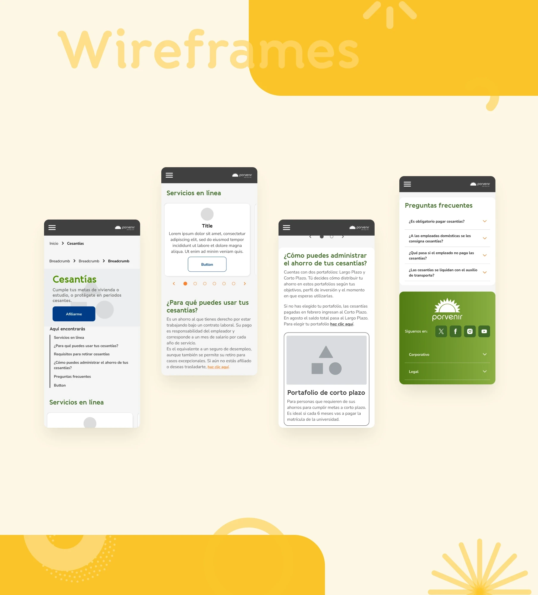
Specify (Interaction and Content Design)
Design and validation of wireframes
Usability tests were carried out with the wireframes designed to determine the level of efficiency, effectiveness, and intuitiveness of the proposal. It was validated how users interpreted the functionality of the buttons.
Findings
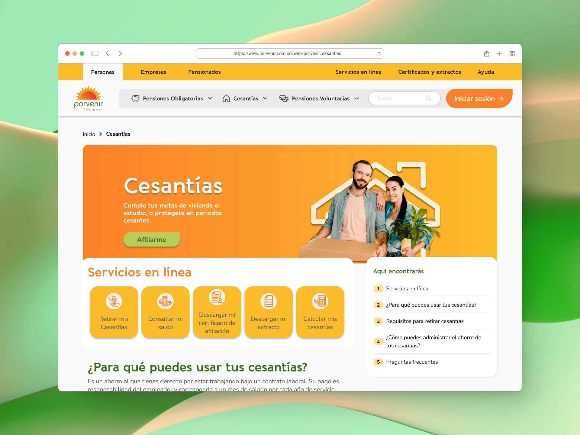
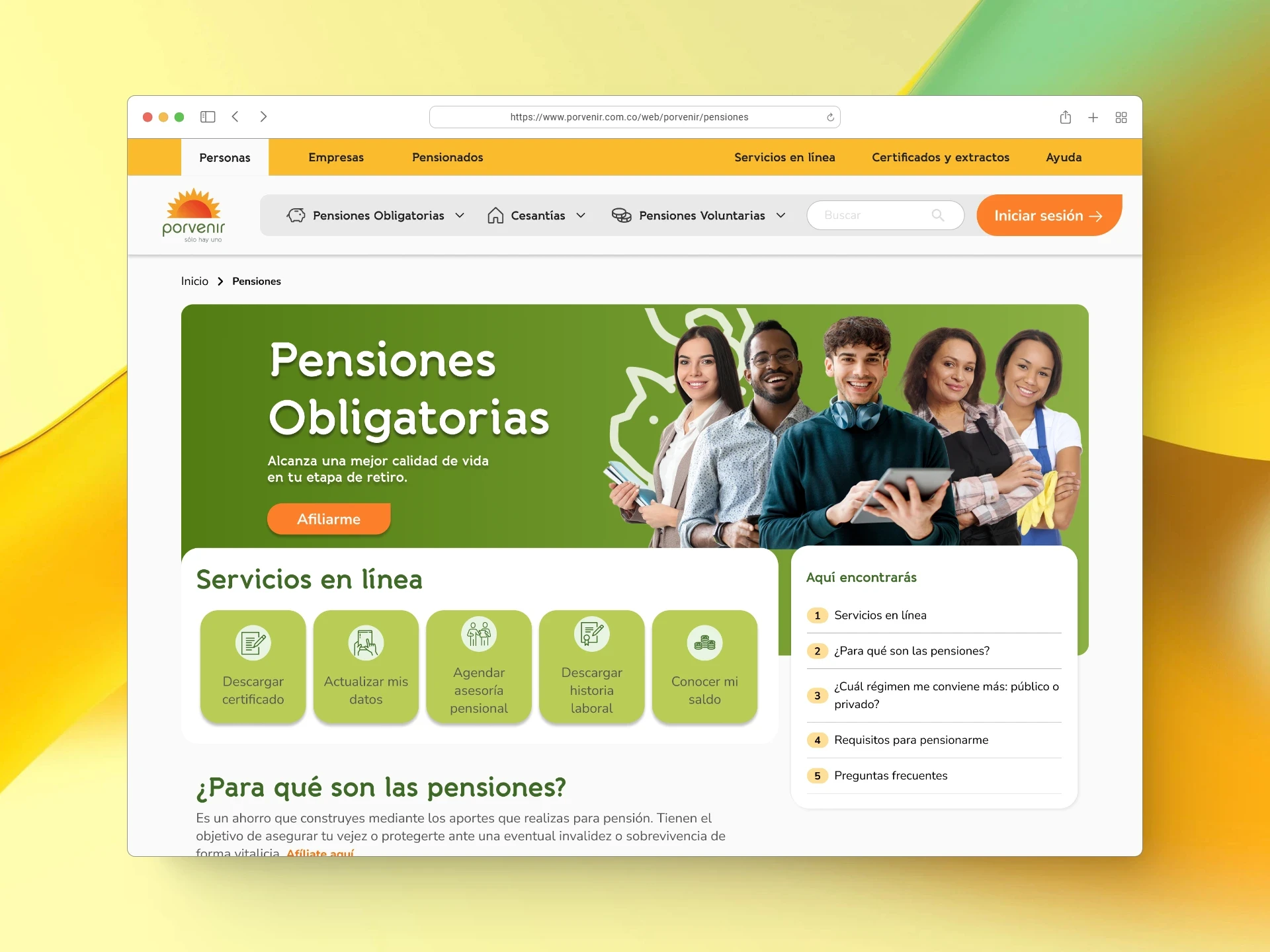
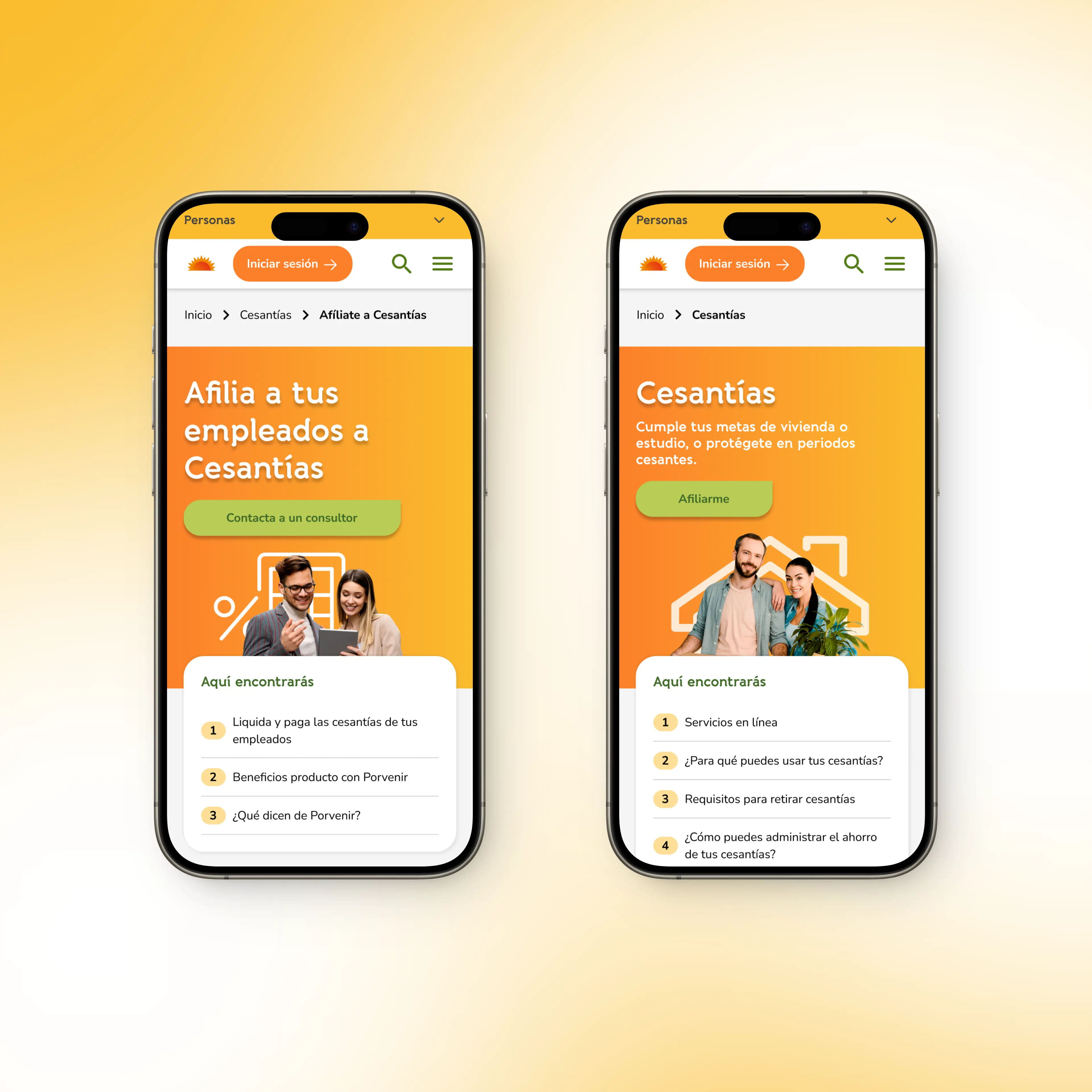
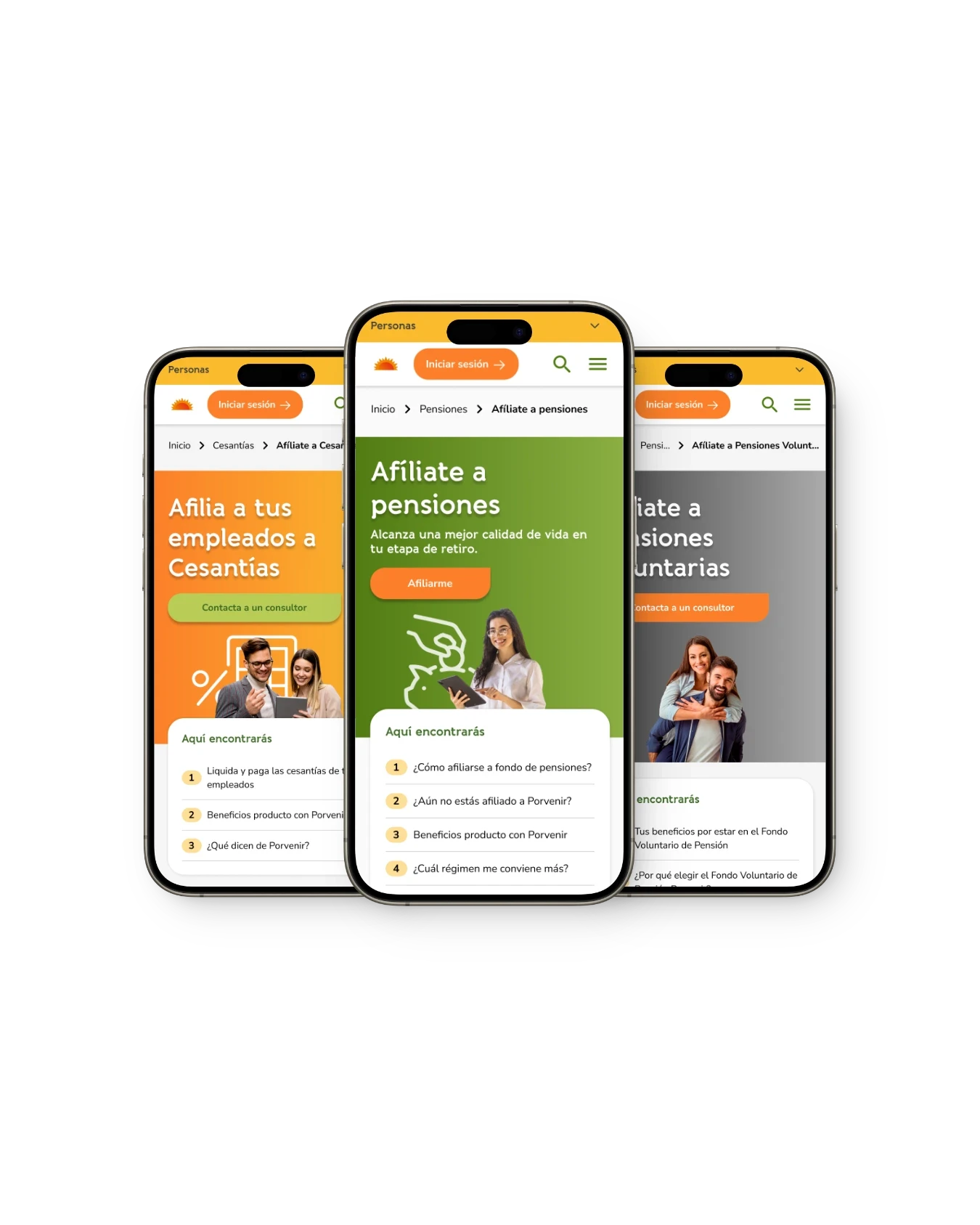
Banner
7 out of 9 users click on the 'Join' buttons when asked to imagine that they are not contributing and want to join Porvenir.
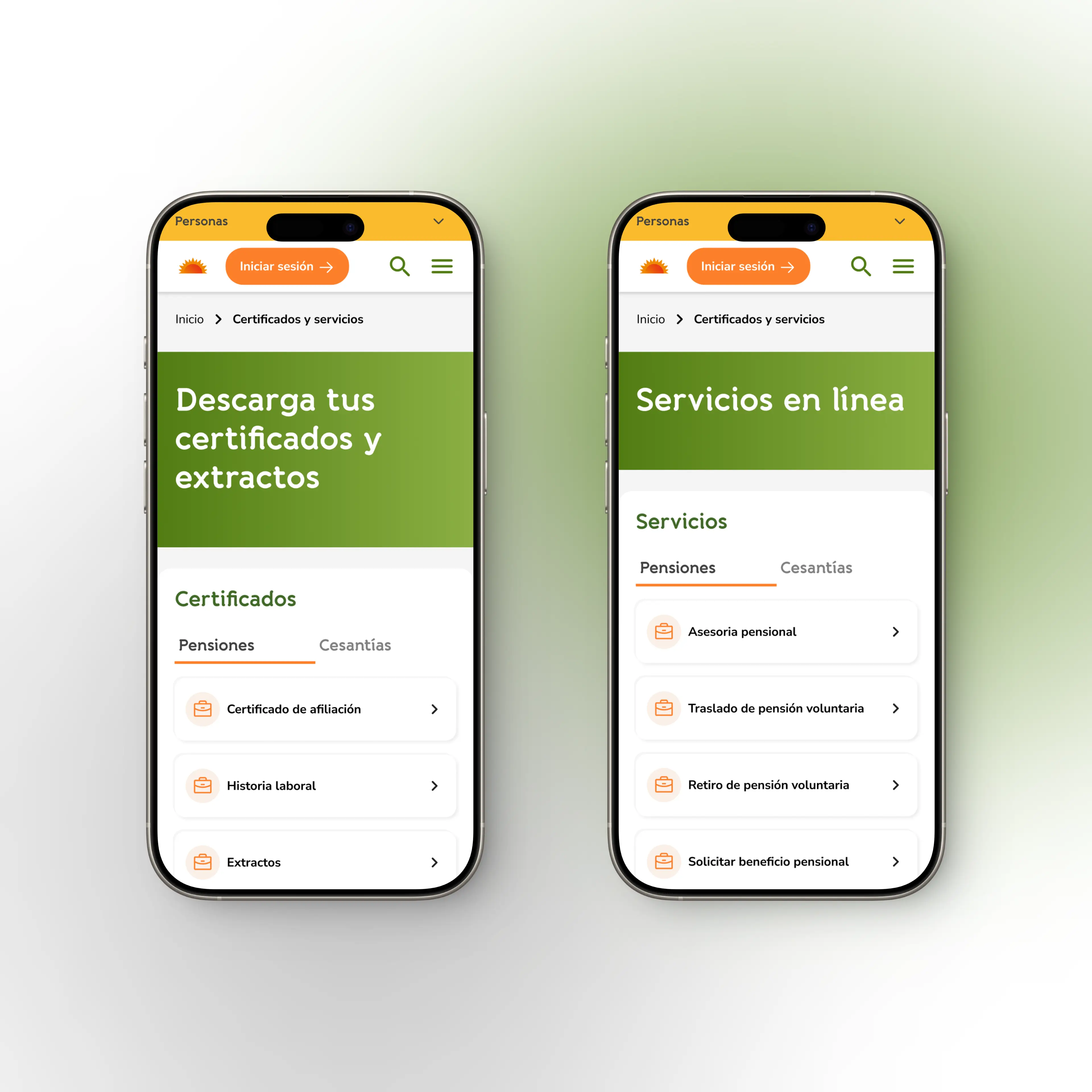
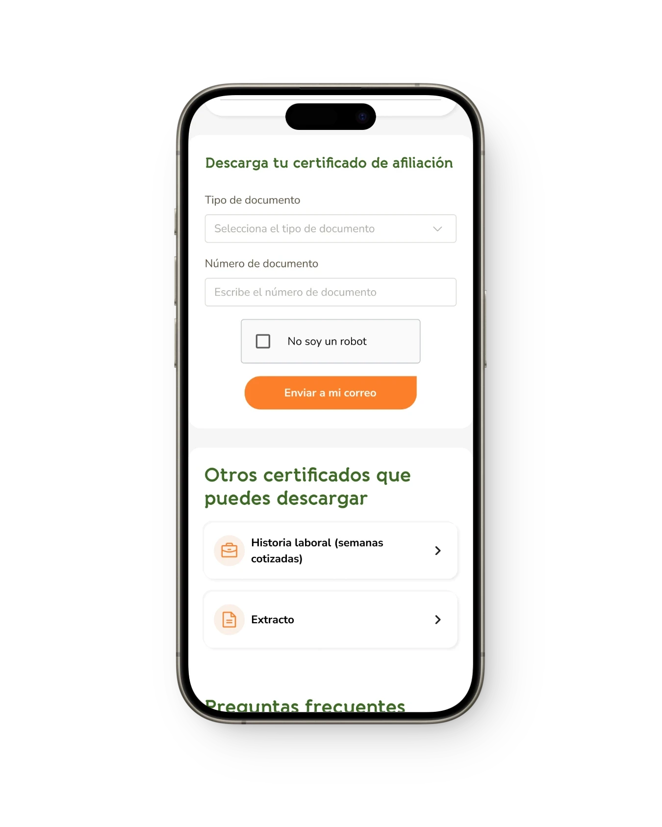
Menú
9 out of 9 users who interacted with the Product Hub screen used the menu, specifically the Affiliation Requirements and Affiliation Process.
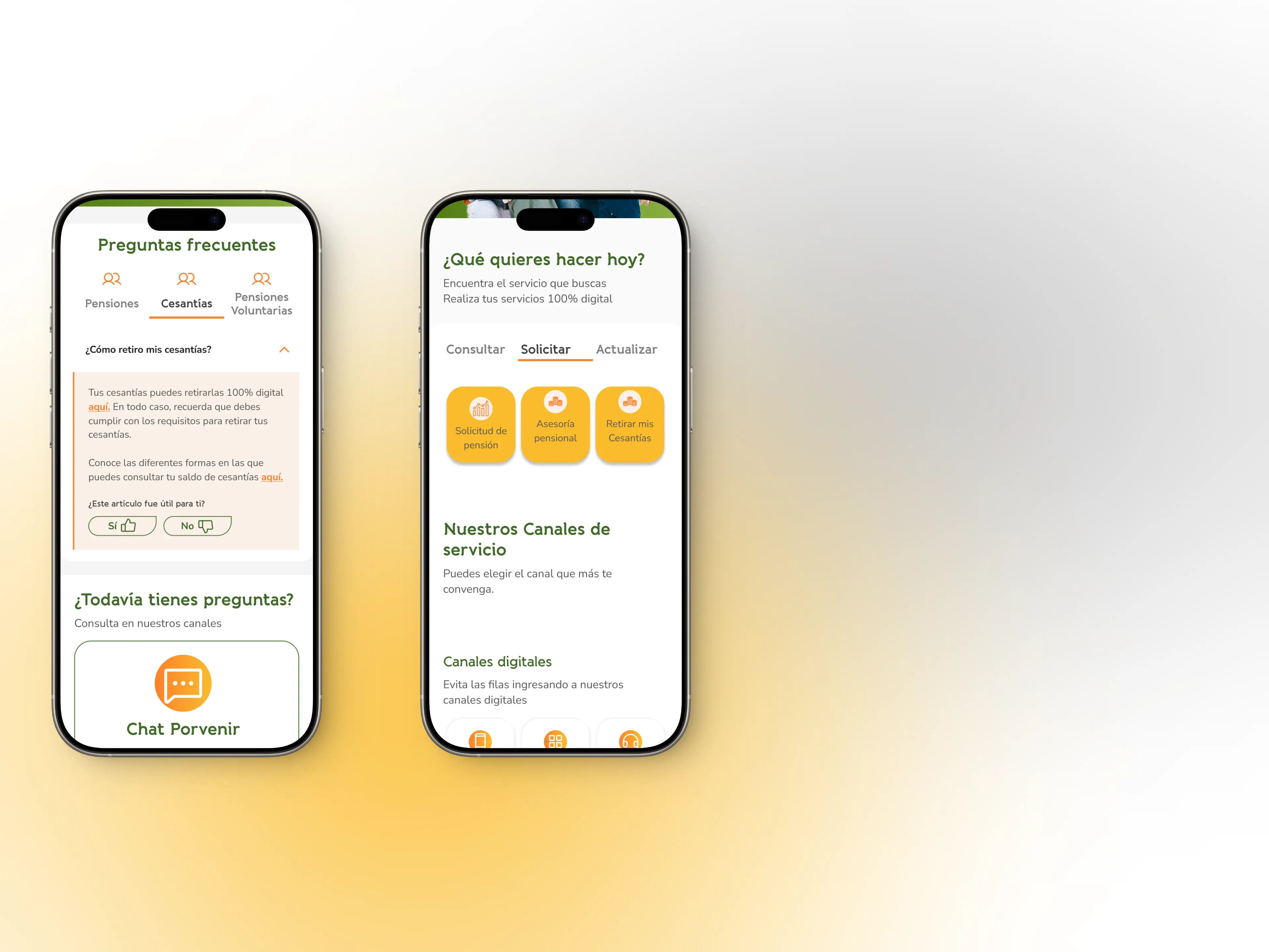
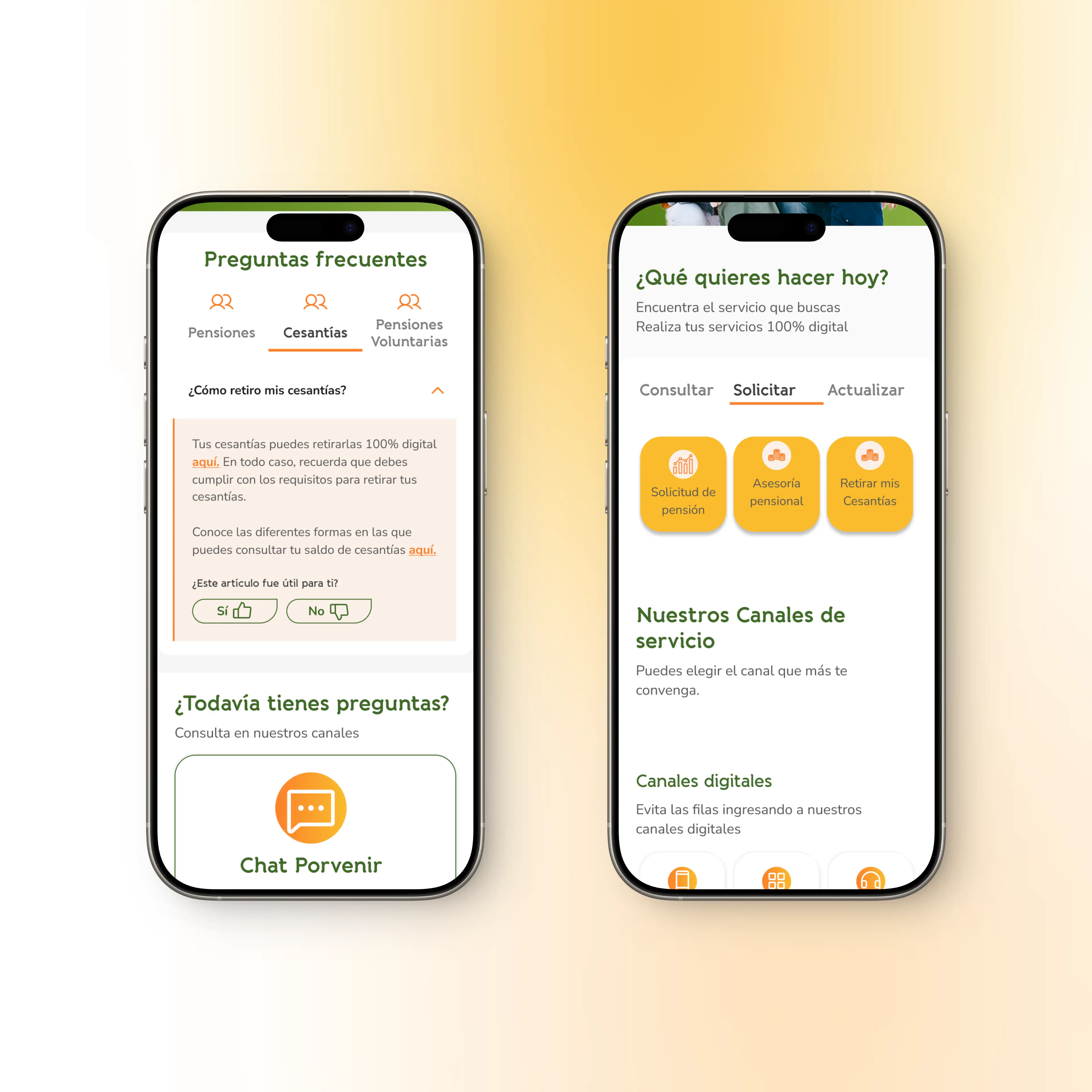
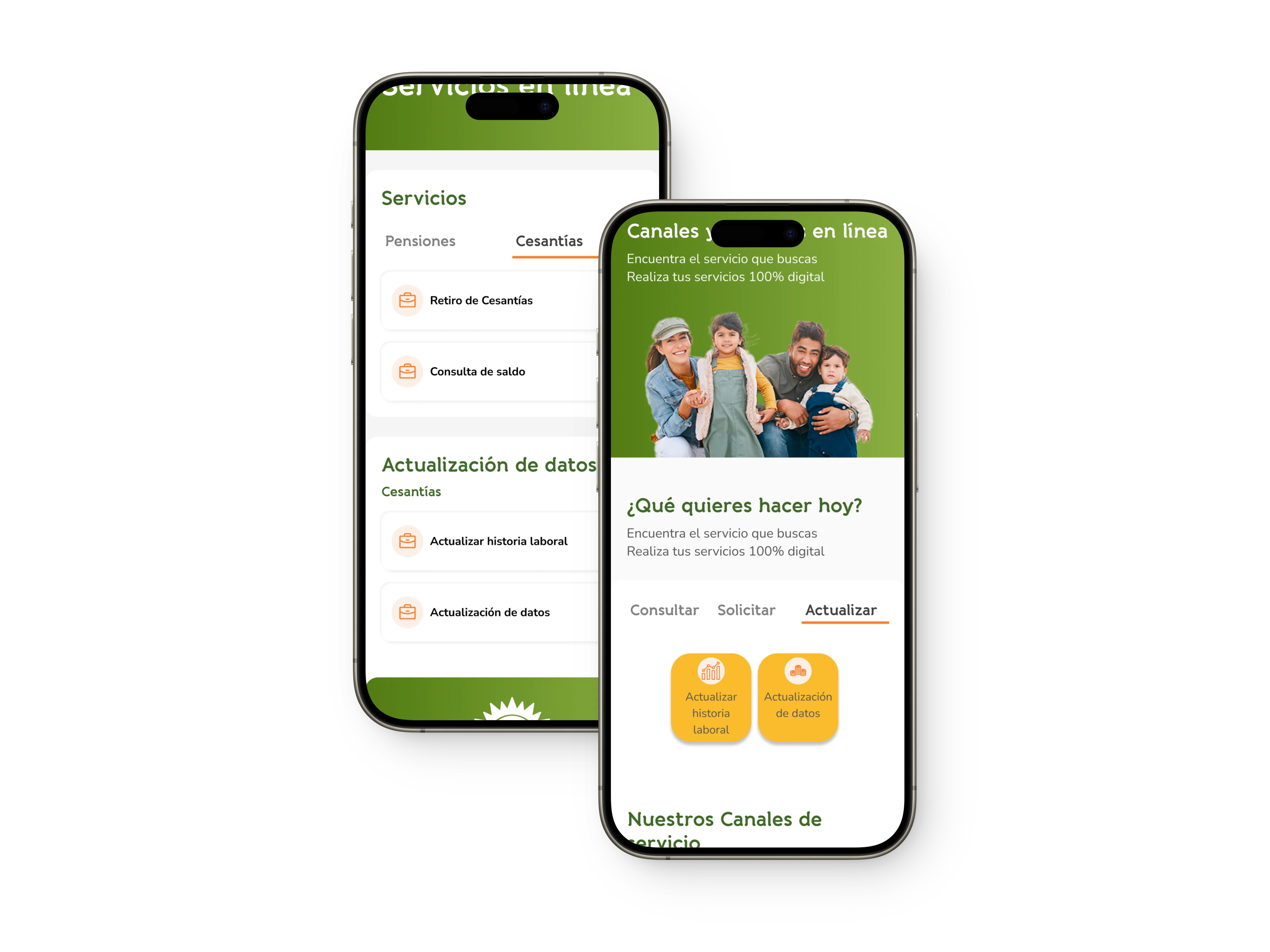
Servicios en línea
“Son claros, concisos, facilitan el acceso a lo que necesitan, con rapidez y sin muchos pasos”
Requisitos para afiliarme
8 out of 9 users, when asked to sign up, started the task by clicking on 'Requirements to sign up'
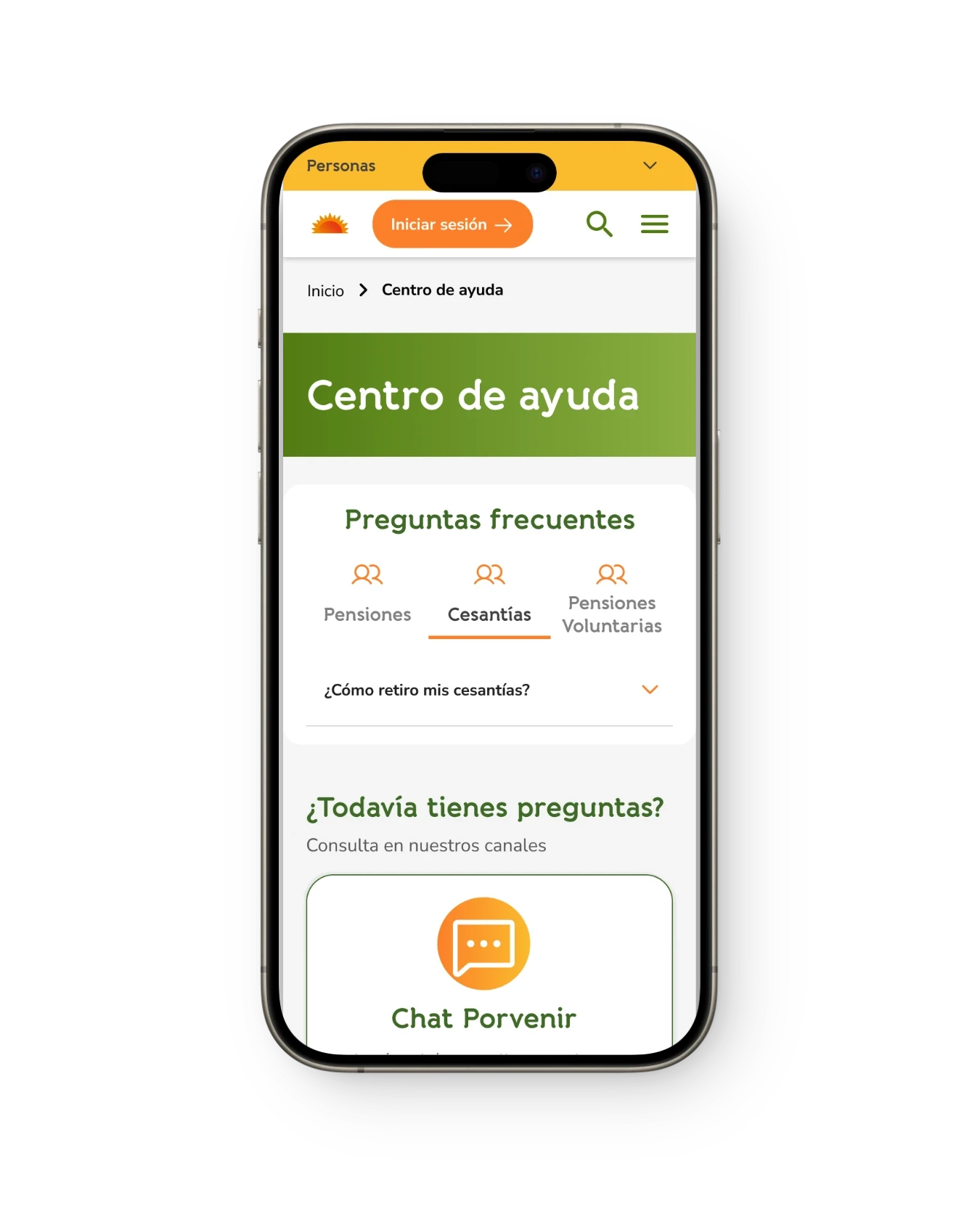
Preguntas frecuentes
“Las preguntas frecuentes son útiles porque me pueden responder mis preguntas sin tener que yo misma preguntar”
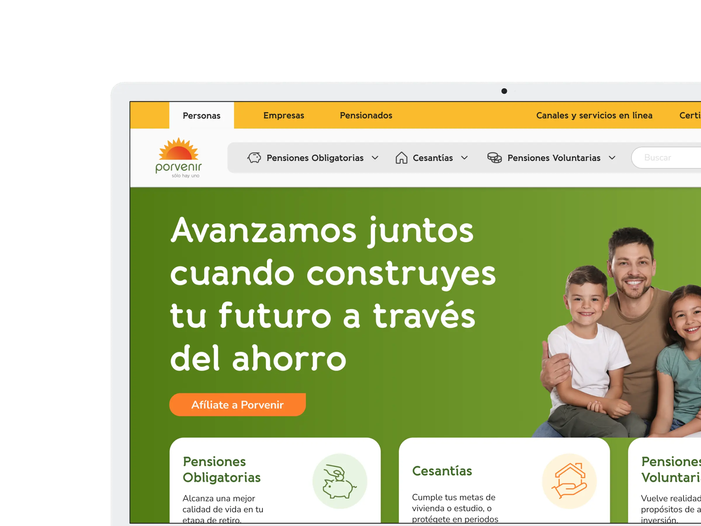
Specify (visual design)
Style guide design
The brand already had a defined color palette in the brand manual, however this was modified to fit in environments that require high accessibility, such as digital products. As for fonts, the goal was for them to be clean for body text because it facilitates reading and is more accessible for populations with impaired vision.
Primary
Banda
Semibold
Bold
A B C D E F G H I J K L M N O P Q R S T U V W X Y Z
1 2 3 4 5 6 7 8 9 0
a b c d e f g h i j k l m n o p q r s t u v w x y z
1 2 3 4 5 6 7 8 9 0
Secondary
Nunito sans
Regular
Bold
A B C D E F G H I J K L M N O P Q R S T U V W X Y Z
1 2 3 4 5 6 7 8 9 0
a b c d e f g h i j k l m n o p q r s t u v w x y z
1 2 3 4 5 6 7 8 9 0
Primary
#FC802A
R: 252
G: 128
B: 42
Secondary green
#3E6A27
R: 62
G: 106
B: 39
Secondary yellow
#FABC2D
R: 62
G: 106
B: 39
Neutral
#565656
R: 62
G: 106
B: 39
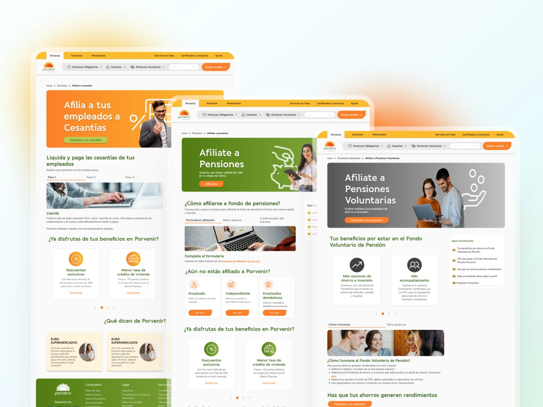
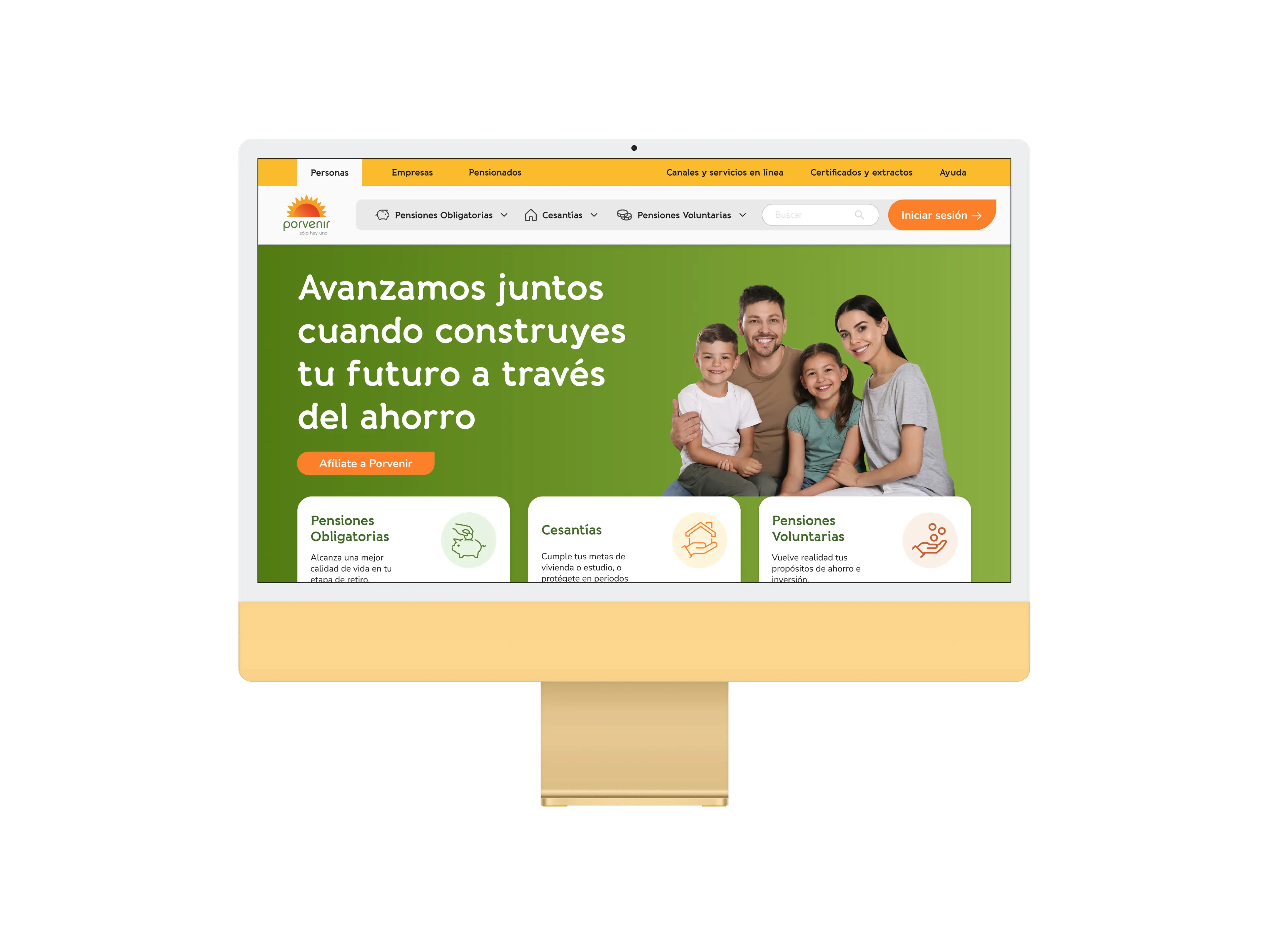
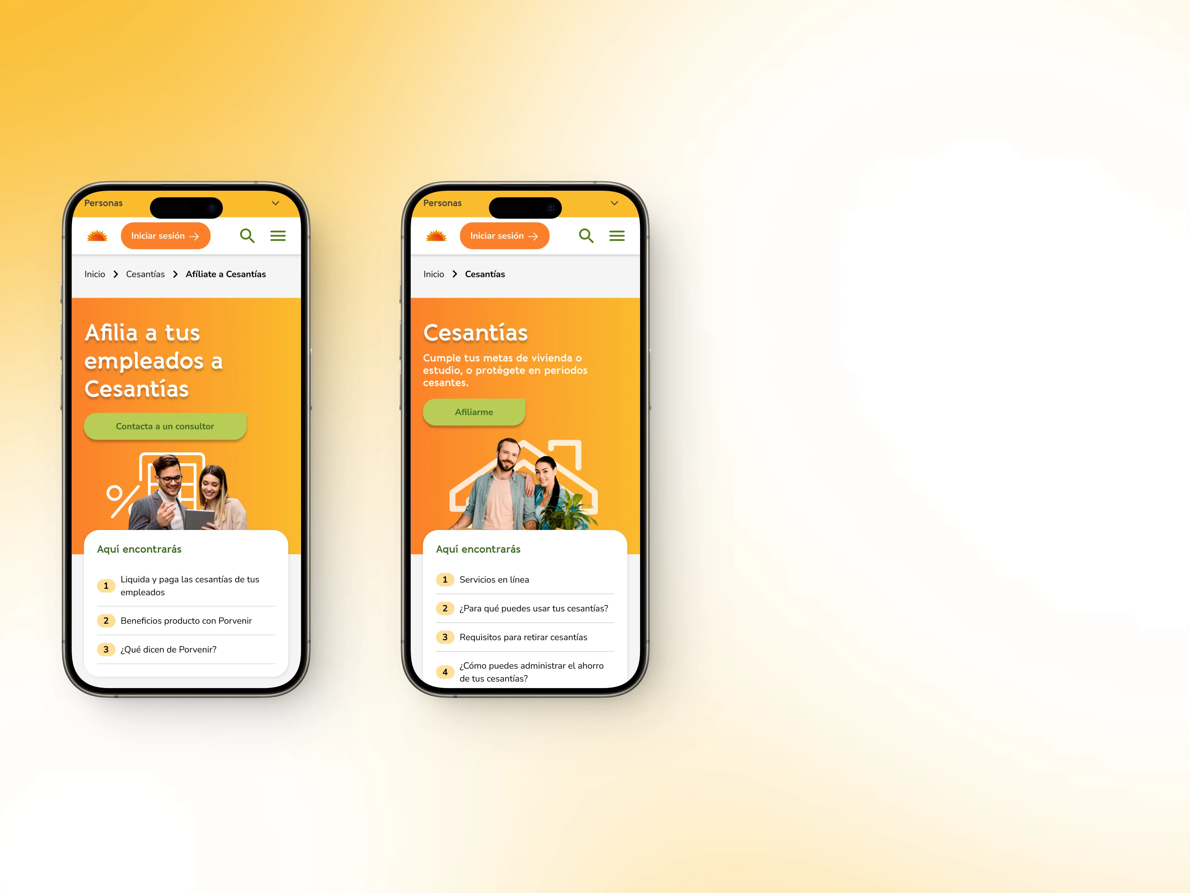
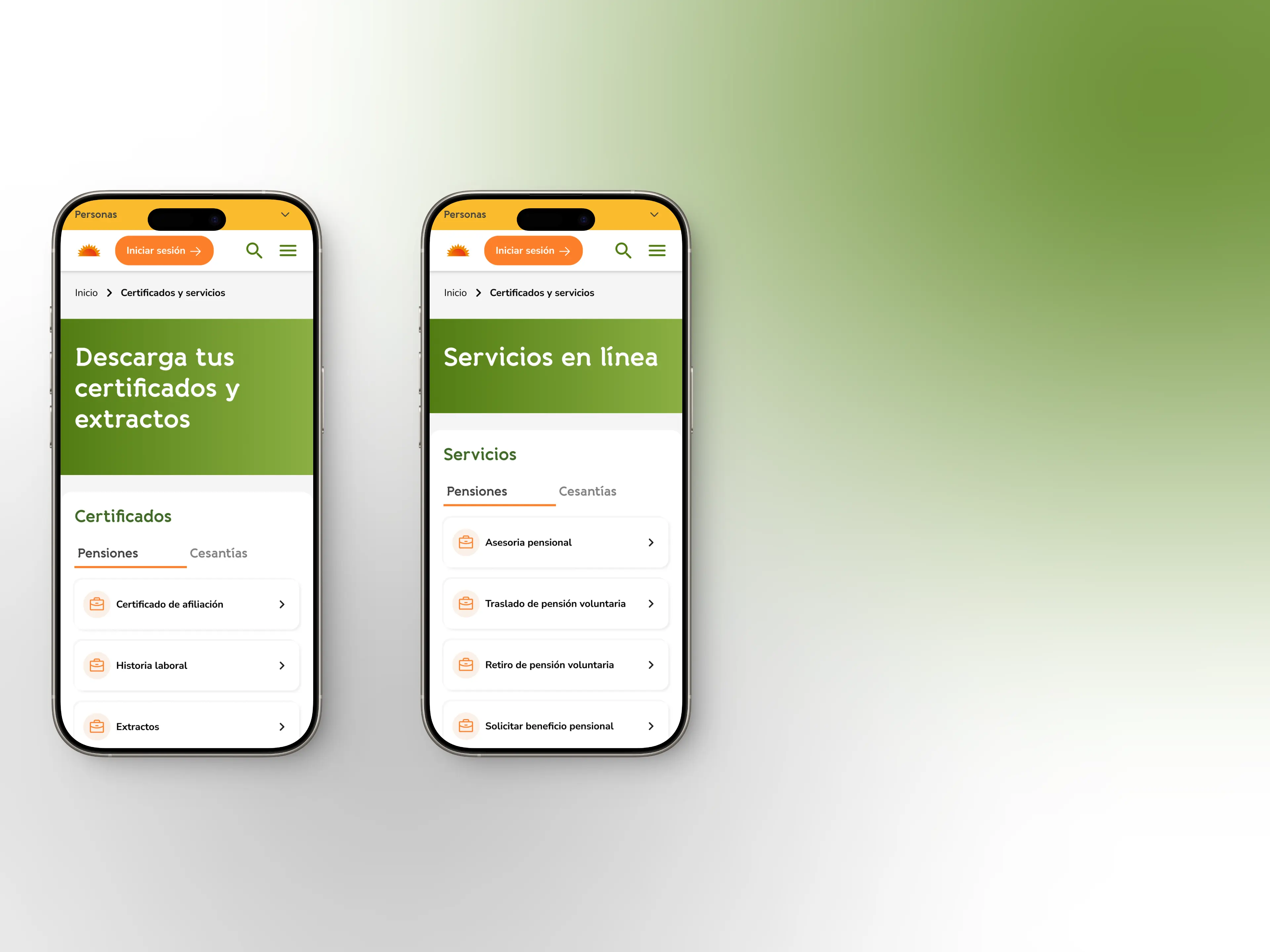
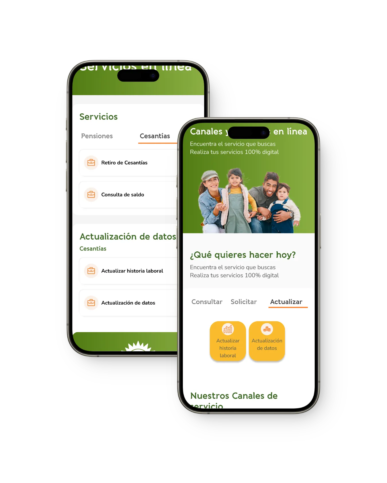
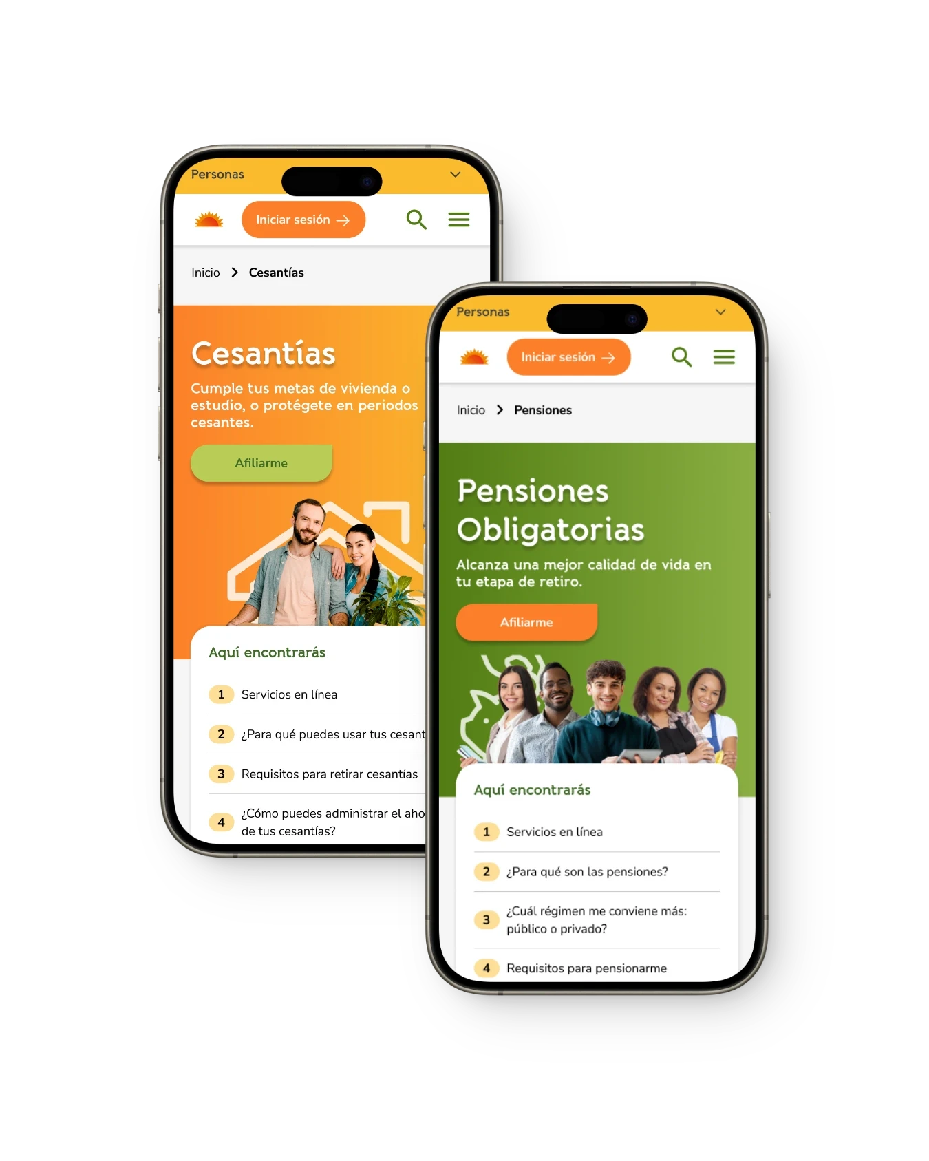
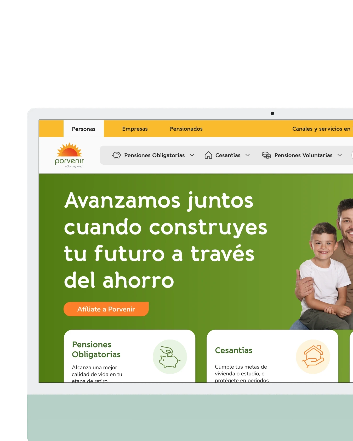
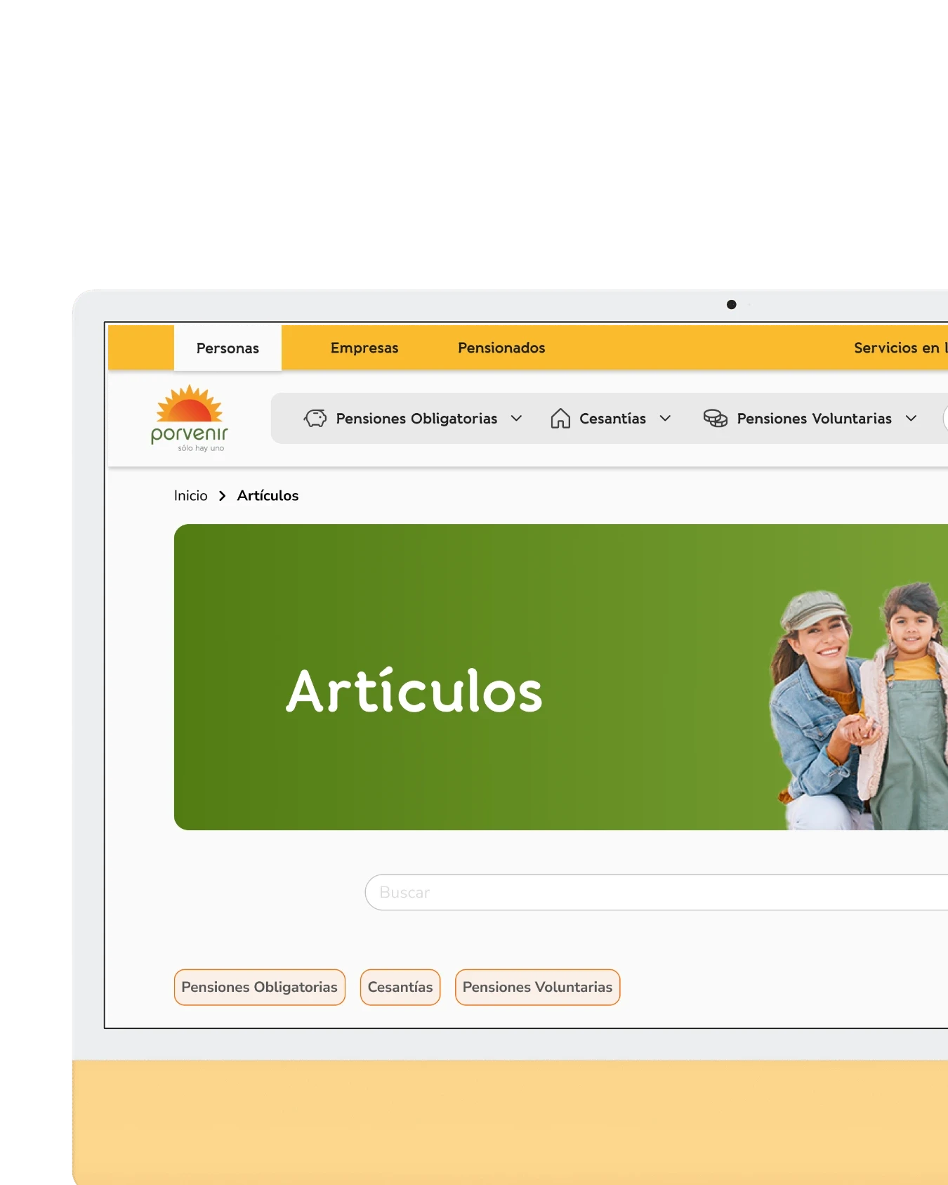
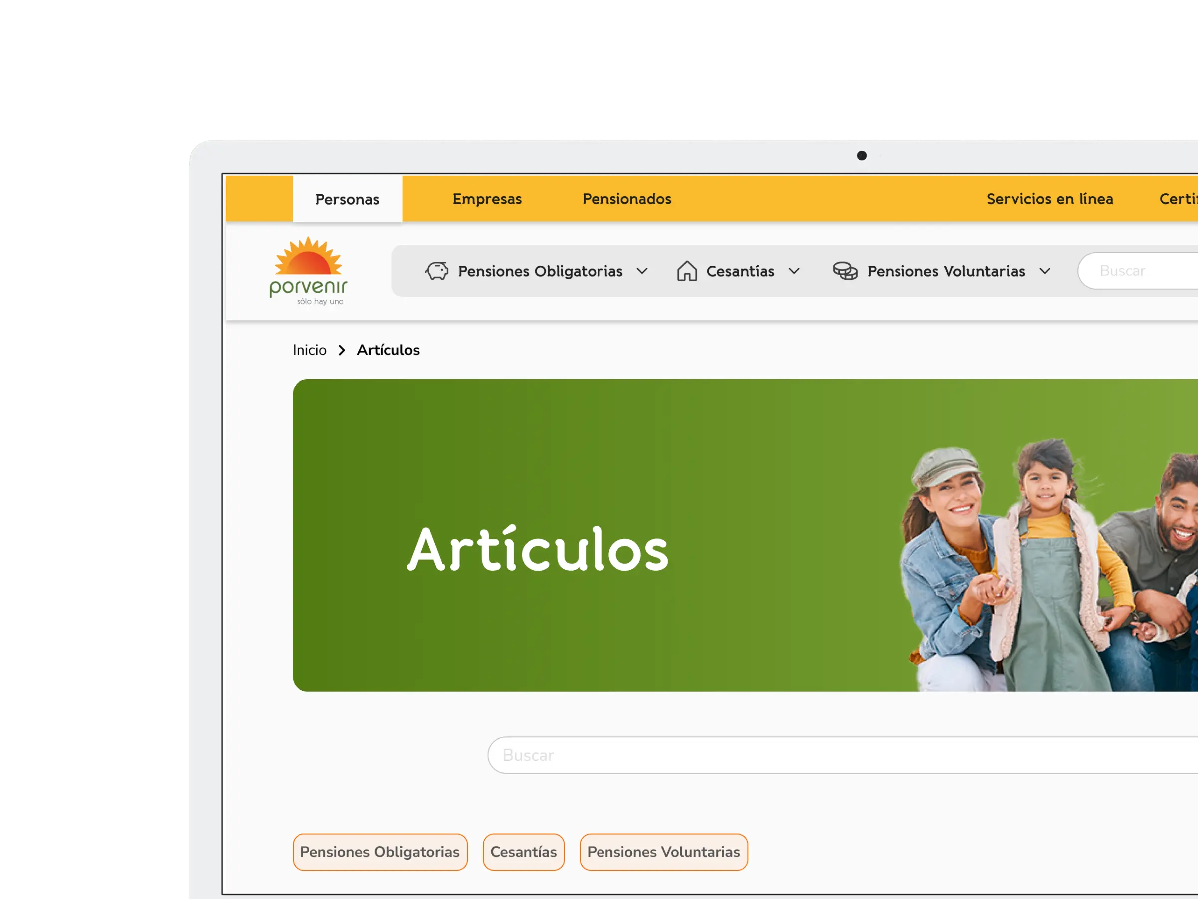
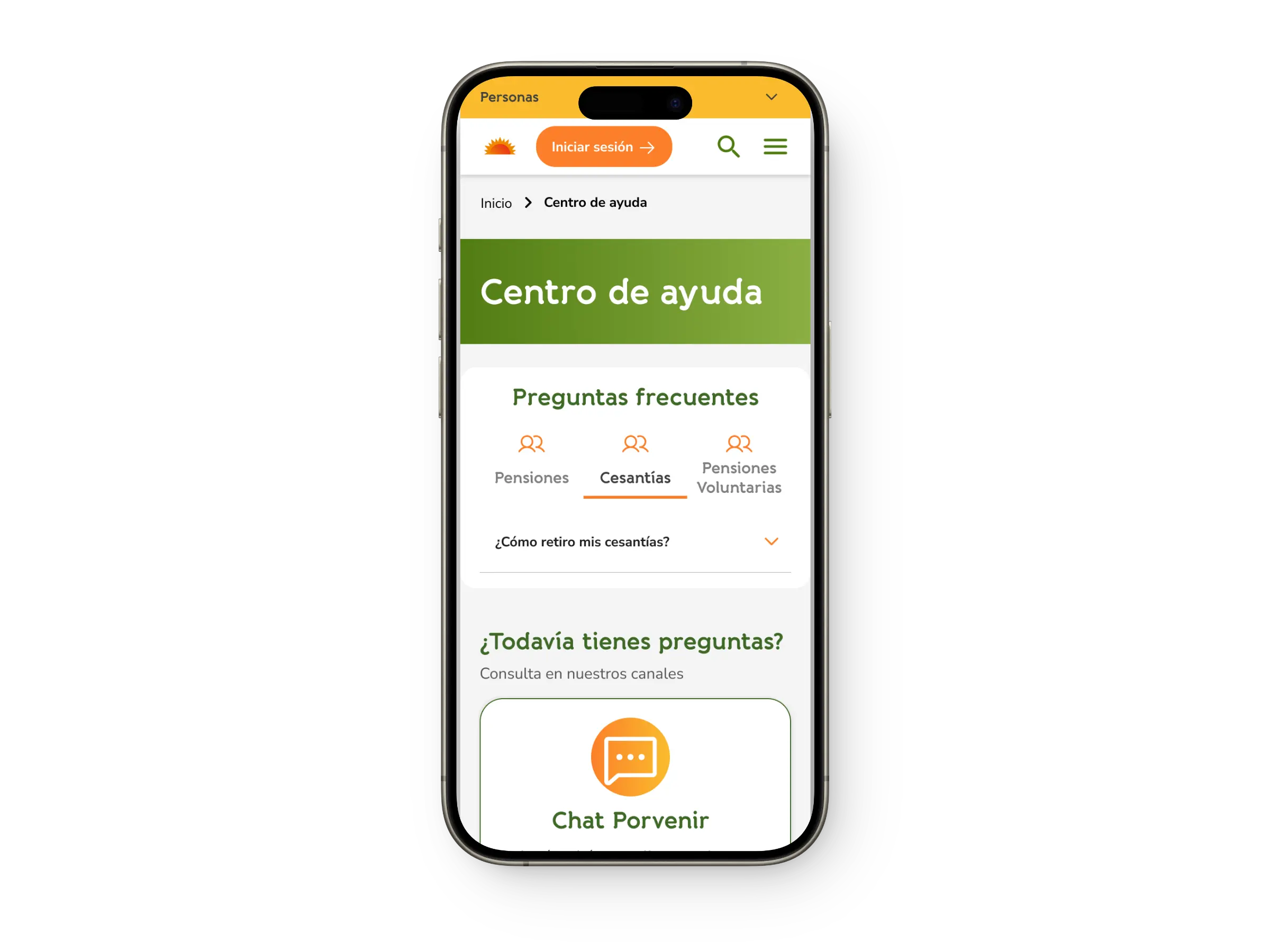
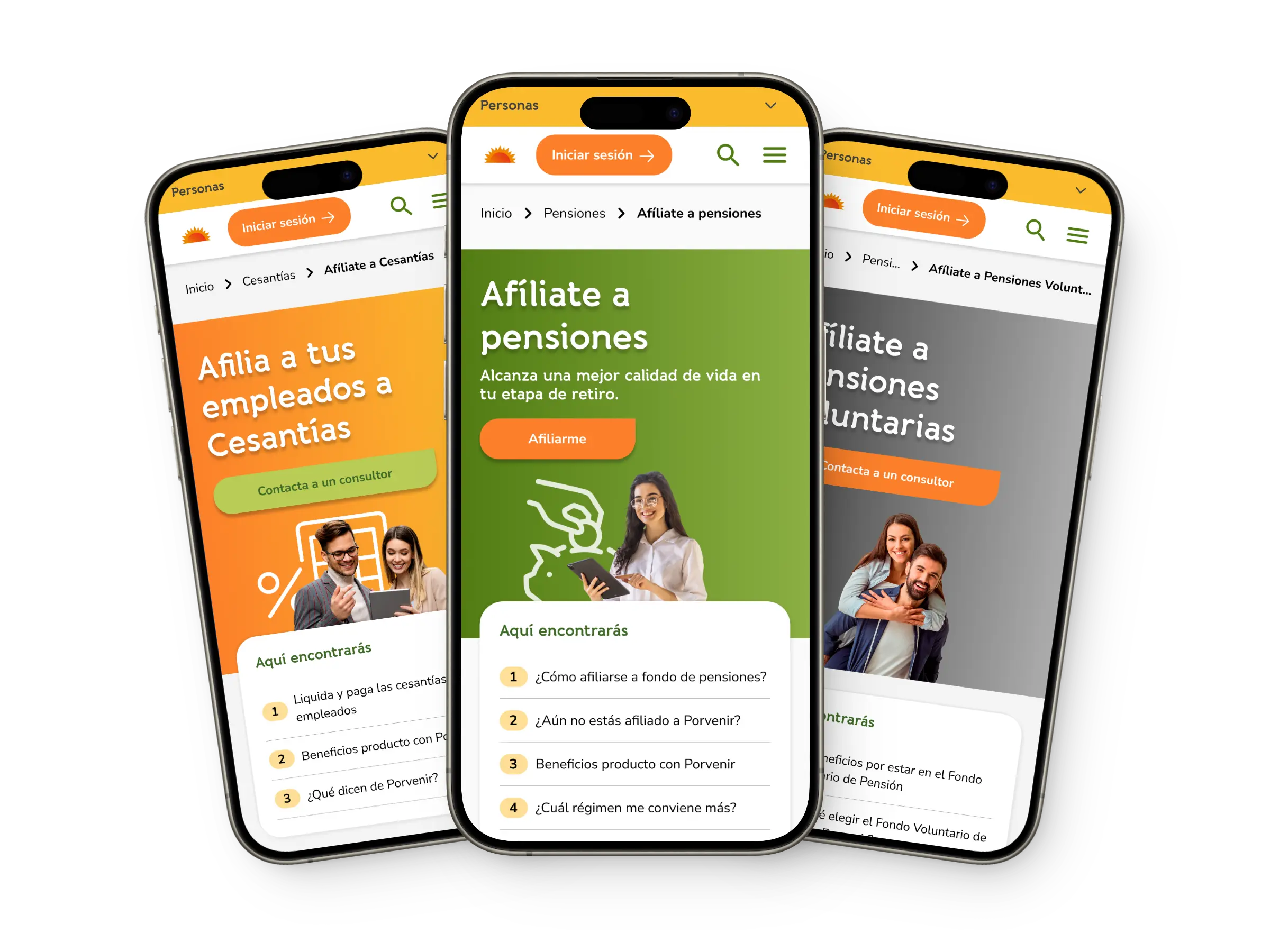
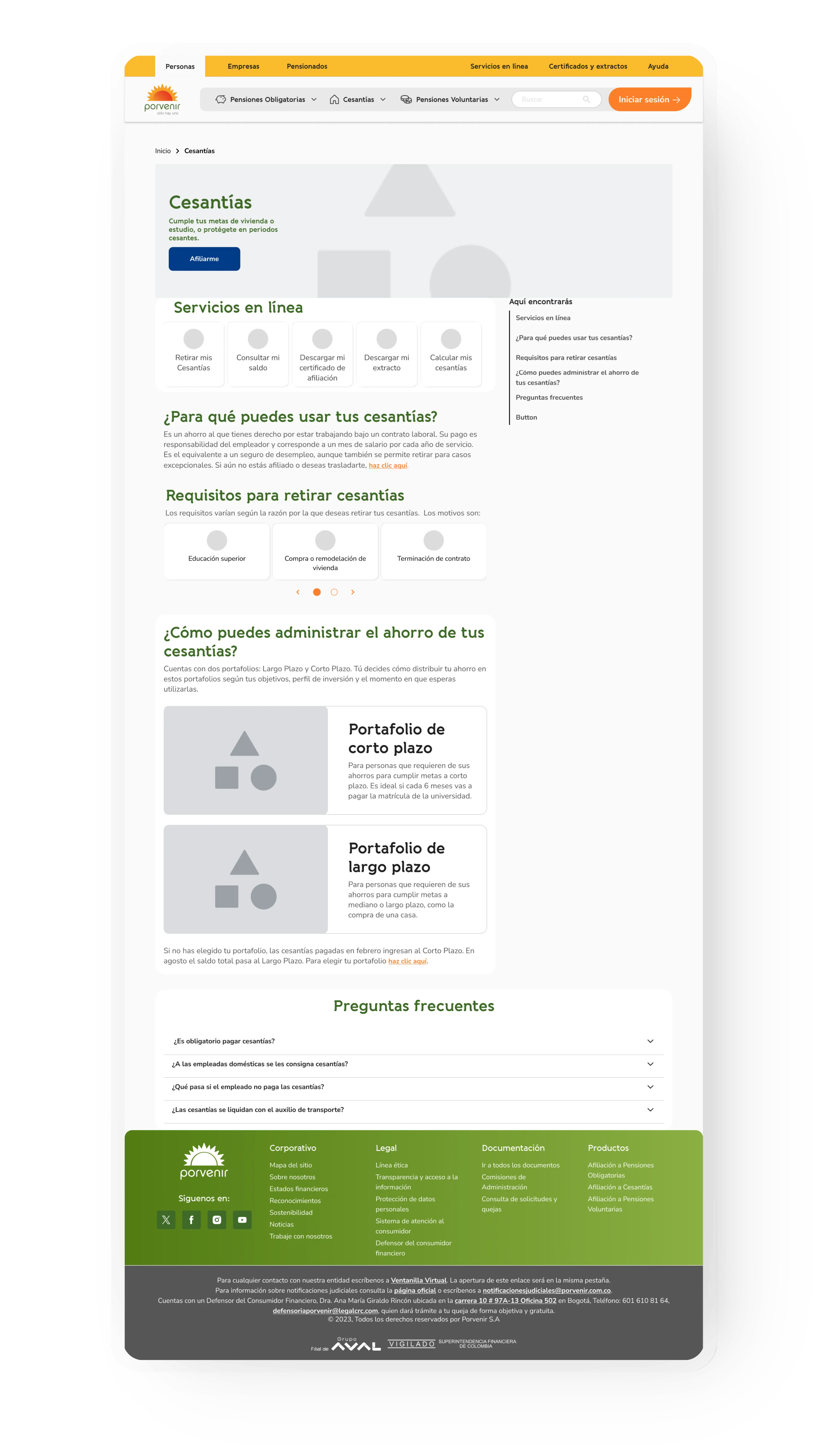
High-fidelity screens
After validating the user experience with the wireframes, the components were then translated into high definition using the style guide and interaction principles.
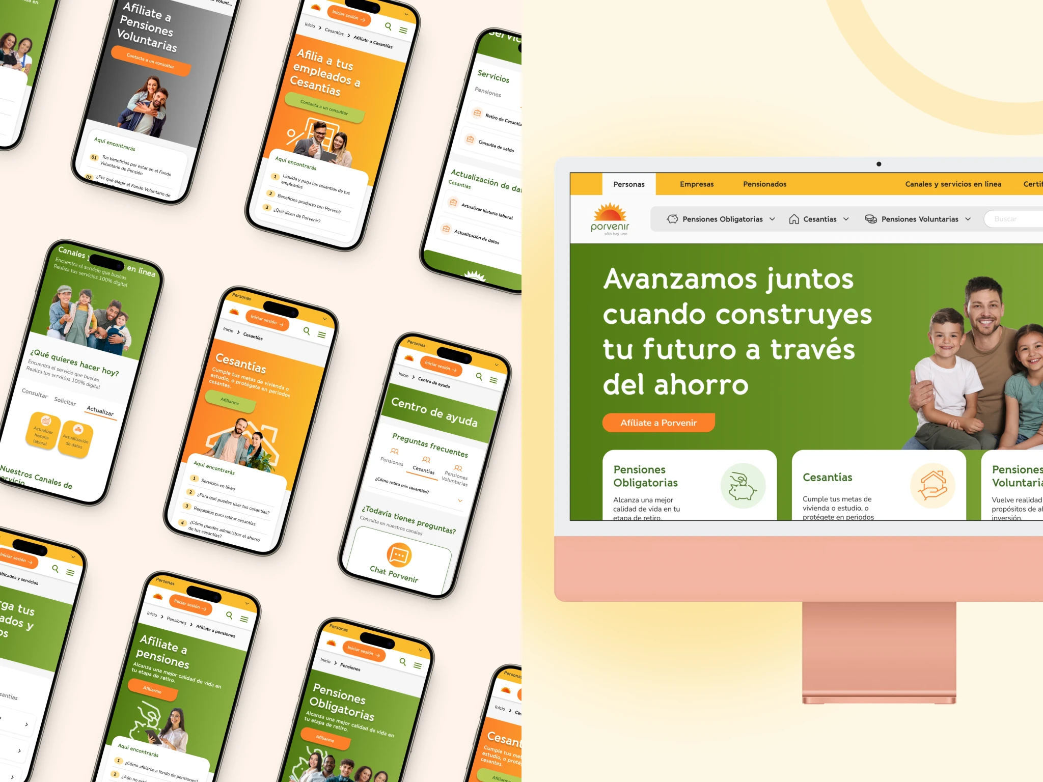
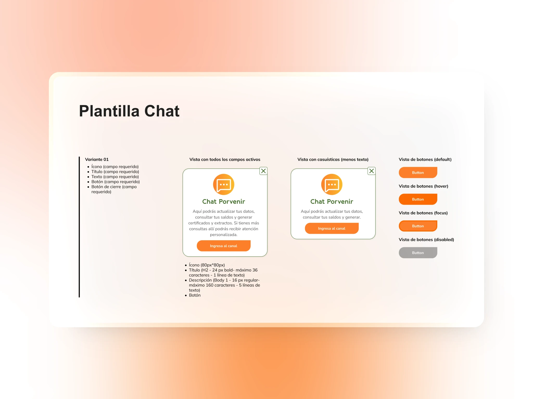
Documentation for handoff
Templates were designed for the components, which are detailed references with technical specifications. These templates ensure that developers or other designers can understand and correctly apply the established standards.
Post-Delivery
Tracking
At the end of the project, the client was given a document detailing how to track channels through two research methods: card sorting and A/B testing; with the aim of validating this section in the future.
01
Identify how users associate the contents of the website.
02
Determine what the degree of efficiency, effectiveness, and intuitiveness is of the two interaction proposals for the Channel HUB.
03
Evaluate and compare the effectiveness and user satisfaction when interacting with one of the two different versions of the Channel HUB.